This index specifically covers the information I have produced concerning my continuing exploration since project 1A.
Soundscaping - the sense of sound

soundscaping in music

Qualitative spatial definition through sound.
For explorations of these foci, refer to the process work for my individual task, and my "Caligari meets Chopin" video.

Alegoric response to character - borrowed materials

high tactility

Relationship of touch to sound
For explorations of these foci, refer to the study of graphite on my hand, the process work between my individual room to the group "opening" task, and the model making task.
Sentient Architecture - the sense of consciousness

Organic form development

Dynamic Lighting

User-activated optical illusions
Explorations of these last foci permeate much of my design exploration since Project 1A, in response to the architecture coming alive, or at least creating the experience of being "present", so please find my work in this area particularly in my drawn plans and sections for the task iterations.


 The site analysis centred around my experience of the site through sound; both digital and "mechanical" sound. I identified certain focus points along the length of the site where the dynamic and timbre of the environmental sound was changed. This was informed by the nature of materials, proximity to traffic corridors (ie the bridge), and passing moments of interaction with other site users.
 The resultant experience was one which left me contemplating the past history of use on the site; industrial, blue collar workers, practical materials, much less weatherworn textures, bright and lively soundscapes created by the milieu of activity.
 And then the formal response culminated in what is essentially a large scale percussion instrument to once again activate the sense of the soundscapes that once may have been heard on the site by harnessing the natural accoustic qualities. By considering the relationship of people to the activation of the Folie, I realised a cyclical relationship where the users must activate the folie, to activate the site, to in turn activate the users' senses. Semi-sentient architecture which exudes an almost autonomous consciousness was the next step.
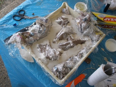
 The first diagram articulates how, as a result of the process of plaster-casting, 3 somewhat distinct layers stacked ontop of each other were formed. This revealed the opportunity for the user to experience remnant evidence of construction in the final form.
 The second diagram concerns the realisation that in order for the walls of the room to float, they needed some way of being tied to the ground. In the model this was able to be achieved by thin but strong nail legs cut into the fabric of the wall. Obviously here, the goal is for subtlety.
 The third diagram shows how we were forced to finally consider the external form of the room, and more importantly, THE RELATIONSHIP BETWEEN THE EXTERNAL FORM AND THE INTERNAL ENCASEMENT. This came from originally neglecting how the room was to be encased in the plan drawing.


 I resolved to document this phenomenon, to accentuate the link between my drawn pencil technique, and my "collected-by-skin" pencil. So, in photoshop, I primarily worked with brightness/contrast and cropping several photographs of my alien hand, along the lines of cubist and surrealist art.